• 🏠
  • work
  • Illustration
  • Contact🙋🏻‍♀️
ella ella  ✨  Daniella Attinella  ✨  Visual Design ✨ Art
  • 🏠
  • work
  • Illustration
  • Contact🙋🏻‍♀️

Thoughts on Trends

OnTrends.png

Trends: Damned if you do, damned if you dont?

Here’s my thoughts on trends- when they’re helpful, when they’re not, what current trends are and my philosophy with using them in branding projects.

Each project is different. I hope I’m truly listening to your unique needs and setting you up with your dream brand you don’t need to change every year to keep up with the times.

Trends can be a powerful tool in communicating your brand is modern, up to date, and worth following as a source of innovative fresh ideas. Trends are helpful tools we can use, as long as we also make sure we don’t just use these trends as a ‘catch all’ instead of really figuring out a brand for you that is unique, bold, and unapologetic.

Also over time, the more a trend is used, the less impact it ends up serving because it becomes a situation of copying each other with the same elements and loosing the individual expression of a brand!

So, my philosophy with trends is about balance. If your brand benefits from using trends, I do still think it’s important to define which you will use, and which will be uniquely a part of your brand. Your core brand shouldn’t go out of style!


This year I’ve noted these design trends in 2021 to take into account:
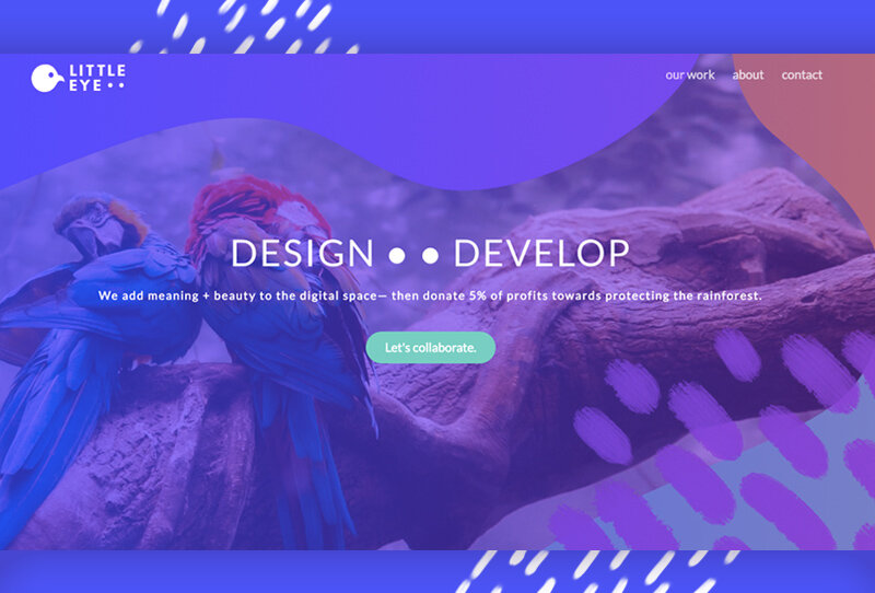
  • soft gradients

  • thin white lines and shapes, mimicking retro computer designs or print registration info

  • lines varying representing different relationships and philosophical concepts

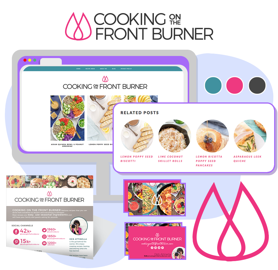
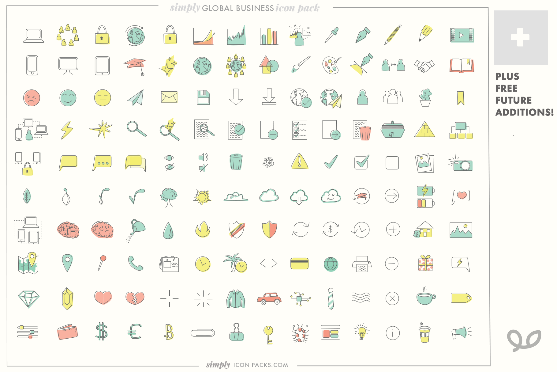
  • use of symbols as a graphic element

  • elegant unique serif fonts, often centered

  • elements from 90’s magazine designs

  • general nostalgia from the 90’s as this generation is in its 30’s

  • bold black outlines with accent color- generally accessibility is taken into account with icons and buttons very clear

  • words shaped into open shapes, such as open circles or waves

  • text warping of quotes, especially in the font ‘Shrikhand’

    I made this graphic to show yes, I am aware of these trends and am happy to incorporate them if it is relevant and helpful to your brand!

    If so I’ll help lay out my game place with how to use these elements while still staying true to your timeless brand.

    Contact me about getting started on your project!

tags: design trends, 2021 design trends
categories: Design, Startups
Thursday 03.18.21
Posted by Danielle Attinella
 

Little Eye Web Development and Design: Reveal!

LittleEye_Thum.jpg

Little Eye: We add meaning + beauty to the digital space— then donate 5% of profits towards protecting the rainforest

Exciting announcement!

As you know, I specialize in all things visual- design, illustration, branding, iconography, etc. while my partner specializes in all things dev- from enterprise software to websites.

Over the past year, we have been collaborating our skills together with our own projects (Split Up!, Hip My Trip, Go Travel Azerbaijan, etc…), as well as projects for friends and family (Cooking On The Front Burner for example).

So, to continue on this path of joining forces we felt it was time to be ‘official’ by creating our own brand + website as a point of contact for our web design shop: Little Eye.

Why the name, Little Eye

There’s actually a bunch of reasons, literal and figurative, that we landed on Little Eye.

Little Eye Develop and Design shop logo

  1. Little Eye refers to the most powerful eyes in the world. These aren’t the largest eyes like you might think, they’re of raptors/birds of prey. This is why the logo includes a bird. You can tell it is a bird of prey by the shape of its beak- how it curves down. If you’re curious, this curve is to help them tear apart their prey, but we don’t mean this concept to be relative to our work ;)

  2. Little Eye is meant to sound humble, not like we are this big agency with lots of workers- because we aren’t. We’re two people, with connections to possibly hire on more people if we need per project.

  3. The initial idea of ‘Little Eye’ was from looking at both our last names, Alili and Attinella. We were thinking of combining them, to Alinella or something like this, but didn’t like how this was not referring to anything tangible and therefor it would be easily forgotten. Then we broke apart Onar’s last name: a + li’l + i. A little eye.

  4. We were hoping to use an animal as part of our logo, because we wanted to incorporate donating part of our profits towards animals. We decided to donate money towards rainforest protection because it protects many endangered animals and rainforests are the most impactful carbon sink (but also the most endangered of forests).

  5. Finally a coincidence- the head of a bird happens to be the same shape of Azerbaijan, the country Onar is from and also the base of our travel site, Go Travel Azerbaijan.

Our capabilities

By combining our skills, we’re able to do pretty much anything on the web. We can create sites from scratch, but also give current sites a makeover.

Sites from scratch (no Wordpress or ecommerce platform)

Hip My Trip web design from scratch

Wordpress makeovers (new branding, graphics, custom ‘related post’ feature without a plugin)-

Cooking on the front burner wordpress makeover design

Browser extension (dev, design)-

Split Up Tabs browser extension

And we also feature custom icon design, since that if often wrapped up in the creation of a site:

custom icon design indie icons for sale

Of course, we’re open to any web related project.

The illustrations

You might notice the cute illustrations we used on the site, and think to yourself, “Where have I seen this style before?”

These illustrations are part of the open-source MIT-licensed illustrations of Katerina Limpitsouni’s project, UnDraw.

What’s extra awesome about these illustrations is not just that they are free to use and part of an extensive modern library that makes the web a more beautiful place, they are all vector! Meaning, each are completely editable and customizable. This is how we were able to create aliases of me and Onar matching the rest of the drawings.

Screen Shot 2018-11-30 at 1.40.53 PM.png
Screen Shot 2018-11-30 at 1.41.04 PM.png

If you have web needs beyond design, we’re here for you!

We just launched our site, and are looking forward to future opportunities to create together.

This project is part of our goal to build sources of income remote so that we can more easily visit our friends and families that are on opposite sides of the world.

Wish us luck!

Thanks for reading, and if you have any questions about our abilities, feel free to reach out to me (hello@loopandlaurel.design), fill out the form on the Little Eye site, or email us (hello@wearelittleeye.com).

—Daniella Attinella

tags: little eye web design, web design, design, remote design, remote work
categories: Design, Startups
Friday 11.30.18
Posted by Danielle Attinella
 

Simply Icon Packs: Royalty Free Indie Icons

Simply Icon Packs

Simply Icon Packs

Any web designer will tell you how often they are using and searching for icons.

There are several places on the web that offer free icons, but typically either you are required to give credit on your page or the icon isn't part of a comprehensive matching pack, meaning you might find one icon communicating what you need but the net one you find might be a different style. On top of that, often any free or paid for icon styles are limited and you tend to see the same files on many websites. 

These consistencies and uniqueness are important when doing high end work, so when I myself was searching for icons to use with my projects it hit me that I could simply draw my own. 

Initially I felt I didn't have time to make them myself, but as I increasingly spent more and more time searching for the perfect icon solutions to no avail, it was clear that I couldn't afford the time not to. This ensured each icon was in the same voice, plus after creating a handful based off need within a few months of freelance design work, I had close to a completed set that I could easily use for future projects. Plus they are customizable, so I could change the width of the line, or use of color/no color depending on what I was working on so they were appropriate to the brand still. 

Having these ready to go has saved me so much time in my designs, on top of that often clients are delightfully pleased to see more visual communication tools when they didn't expect it.

My partner, a developer, insisted in the value of icons like this from indie designers and encouraged me to make something with the concept. Since I'm basically always excited about starting new projects out there in the world I gladly accepted the challenge.

Hence- the birth of Simply Icon Packs!  

Simply Icon Packs logo

Simply Icon Packs logo

The goal of the logo was to make sure "Icon Packs" was most clearly visible from a distance with "Simply" having some more personality. I'm able to use the "Loop & Laurel" symbol as the crown of the logo- providing a subtle link to my two names without being overt. I did some research on other icon making firms out there, and decided on the Italicized Serif font as a way to differentiate to make sure I am my own brand. I actually really like how the Loop & Laurel logo acts like a crown because it reminds me of the word royalty, and I want people to remember these icons are royalty-free and CAN be used for commercial purposes. (Of course they can't be redistributed or sold though). I also like how "Simply" is set up to potentially down the road be a new entity.

140 Modern Business icons- Simply Icon Packs

140 Modern Business icons- Simply Icon Packs


Something that sets me apart from other icon options is I prepare the icons for color- they are ready to be used as-is but they also may be edited to specific brand colors.

I also offer custom icon add-ons in case a business knows they have specific concepts to communicate that wouldn't be included in the general pack.

Currently, as of July 2nd, I have 2 icon packs available on the website (a simple SquareUp site for now) and also on my new Creative Market page! (I'll write more about that later)

  • 140 Modern Business Icons color + no color (Simply Icon Packs) - Includes for free any future additions (I plan to add 10 more in the near future). Great for developers, designers, hobbyists, etc. Anyone that could benefit from having a ton of visual communication tools on hand.
  • 25 Italian Food & Drink Icons color + no color (Simply Icon Packs) - Perfect for branding, packaging, store signage, menus, sky's the limit! Great for business owners, designers, bloggers, etc.

For now I am working really hard on creating lots of icons! My notebook currently has a page of Travel-related icons that I'll be polishing and bringing them into the computer.

I also want to have fun with mockups of the icons- they can really tell a story of how these icons may be used. 
 

Italian Food and Drink (SimplyIconPacks.com)

Italian Food and Drink (SimplyIconPacks.com)

Italian Food and Drink (SimplyIconPacks.com)

Italian Food and Drink (SimplyIconPacks.com)

So that's it! Wish me luck on creating lots of new icons. It's fun for me to make them (the best part is adding the color). I hope as an indie designer I can figure out how to find people that would be interested in these. (Marketing is my least favorite thing.....unfortunately)

Thanks for reading,
Danielle

tags: icons, icon packs, simply icon packs, design, Remote Design, Remote Work, Graphic Design
categories: Design, Startups
Monday 07.02.18
Posted by Danielle Attinella
 

Startup jitters: 'Hip My Trip' (hopefully not 'Trip & Break My Hip')

HipMyTrip_horz.png

UPDATE: website is live! HipMyTrip.com thanks to collaboration with Onar.

I've been waiting to write about Hip My Trip until the website was up and I could proudly share the completed project, but I saw a lot of value in expressing where I'm at right now in the beginning stages.  So, as of March 28 2017, this is where I'm at.

What is Hip My Trip?

Hip my Trip is my project, currently just living on Etsy, that creates custom artistic maps to remember your impactful trips. It was started after I plugged in the route of my round-world trip in 2016/17 to Google Maps. It was functional, but for extra fun I made a stripped down version that was much more aesthetically pleasing. It hit me that many others probably would love to have a way to show special trips or geographical locations. So I researched, and saw there were definitely a handful of shops (largely on Etsy) that were selling geographical prints and products, but I couldn't find anyone actually showing the route, which to me was the best part! The route is what you're in charge of, there's a lot of pride and significance in it.

Custom Topographic Map Design

Questions that keep me up at night:

  • Is no one specializing in trip routes because there's no demand for it?
  • How the hell do I compete with other map art companies that have had their shop open for 7+ years and have 6k sales? How do some of these shops pay for thousands of listings? How do people even find me on Etsy if these companies completely swarm the space, with employees to help and Etsy SEO tools to keep all products new and in front of others?
  • Ethically am I supposed to be creating all the background patterns? Is it fair if I purchase a pattern and use repeatedly on products? Is it OK to use patterns that belong to other cultures? Isn't it unethical as a white person to use elements from other cultures to make a profit? Does that change if I buy directly from artists and use credit? Is it OK to create my own patterns from elements I take from stock art?
  • How would I be able to afford to offer any small items if the custom design time is what costs the most, not the materials? Are there products I can offer other than posters that are still cost effective and worth it for the customer to hire me for? Do I want to only be open to custom work?
  • Is it worth putting hours of time into setting up geographical prints and products like the other shops with my own style, or are people just looking for whats cheapest, which I cant afford?
  • Is it worth all the time and effort to post and manage my Instagram and social channels just for hope that someone will be a customer from it? Other shops with tons of sales don't seem to be stressing about it and they are quite successful.
  • Is the name Hip My Trip, and concept of focusing on the routes from trips, too narrow of a category? Do I think it's a great idea because I'm weird and don't relate to most people and what I might think is a great idea might not be as celebrated by others? Is traveling for leisure too much tied to privilege? How to I try to be aware of this and balance with some good?

Thoughts that keep me going:

  • I believe in the product- it's beautiful and lets you tell your story 
  • The feeling of inadequacy and comparison to other shops is a blessing and a curse. Of course it eats me up a bit to think of how late to the game I am compared to these other companies who have been published in magazines, blogs, etc. But, it also gives me inspiration because that means enough people love maps and the emotional significance they hold
  • Maps encourage curiosity and let us think more globally, peacefully
  • I always dreamed of being a good pattern designer, and this medium lets me try out different concepts and be my own art director
  • Getting a new order brings me such a thrill-not because of the money, but because it means I've connected with someone, they've seen me and appreciate my vision, and more importantly I get to hear of their wonderful stories of their trips which is truly inspiring!
  • I don't have a job. (Hopefully) finding freelance gigs, a PT mindless data collection job, and my projects are what I have. This is my special time to build something that matters.

    Today I just started obsessively creating templates and images for some pillows. I believe they are beautiful and I want to keep pushing myself to only create things I truly love to see, instead of something I assume others would want to just fill space in their home. Intentionality is my goal. 
Custom Unique Texas Pillow Botanicals

And here's a pattern I designed! I'm really happy with it: 

Custom Minnesotan Pillow Unique Gift

I want to keep my standards high, surprises often, and quality top notch. Thing is there's SO MUCH I want to do, and I feel SO BEHIND others. But I'm trying to stay focused on why I believe in this project and keep moving forward each day, even if it's a tiny bit. 

And just like in other aspects of life, it's smart to value your differences. Following, or believing you're supposed to be in the same game as others, doesn't get anyone anywhere and that belief comes from fear of failure. I'm trying to figure out how my unique perspective and values can be a greater focus of the work I put out in the world.

For now- the website. There's a whole lot to tackle in a custom website that includes collecting specific information and payment- and currently it's just set up for the custom posters. Eventually I hope to expand and have more pre-designed map products, and have fun with pattern creating like I always dreamed of as a kid. I'm soooo lucky that my partner can make anything possible I think of and is working on it for me. Well, it's part of our goal to have projects together under a new entity, but that will be sometime in the future and saved for another post.

I'm trying to not feel overwhelmed and take it one step at a time. Wish me luck! (So far it's not going the best...........)

Thanks for reading,
Danielle

tags: startup, hip my trip, maps, WIP
categories: Design, Startups
Wednesday 03.28.18
Posted by Danielle Attinella
 

tell me about your project ⚡️ hello@ella-ella.studio  I   © 2021