• 🏠
  • work
  • Illustration
  • Contact🙋🏻‍♀️
ella ella  ✨  Daniella Attinella  ✨  Visual Design ✨ Art
  • 🏠
  • work
  • Illustration
  • Contact🙋🏻‍♀️

Little Eye Web Development and Design: Reveal!

LittleEye_Thum.jpg

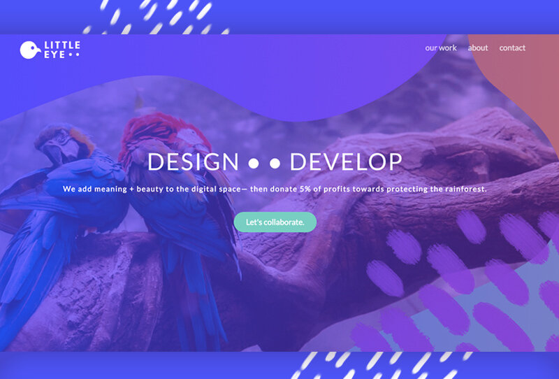
Little Eye: We add meaning + beauty to the digital space— then donate 5% of profits towards protecting the rainforest

Exciting announcement!

As you know, I specialize in all things visual- design, illustration, branding, iconography, etc. while my partner specializes in all things dev- from enterprise software to websites.

Over the past year, we have been collaborating our skills together with our own projects (Split Up!, Hip My Trip, Go Travel Azerbaijan, etc…), as well as projects for friends and family (Cooking On The Front Burner for example).

So, to continue on this path of joining forces we felt it was time to be ‘official’ by creating our own brand + website as a point of contact for our web design shop: Little Eye.

Why the name, Little Eye

There’s actually a bunch of reasons, literal and figurative, that we landed on Little Eye.

Little Eye Develop and Design shop logo

  1. Little Eye refers to the most powerful eyes in the world. These aren’t the largest eyes like you might think, they’re of raptors/birds of prey. This is why the logo includes a bird. You can tell it is a bird of prey by the shape of its beak- how it curves down. If you’re curious, this curve is to help them tear apart their prey, but we don’t mean this concept to be relative to our work ;)

  2. Little Eye is meant to sound humble, not like we are this big agency with lots of workers- because we aren’t. We’re two people, with connections to possibly hire on more people if we need per project.

  3. The initial idea of ‘Little Eye’ was from looking at both our last names, Alili and Attinella. We were thinking of combining them, to Alinella or something like this, but didn’t like how this was not referring to anything tangible and therefor it would be easily forgotten. Then we broke apart Onar’s last name: a + li’l + i. A little eye.

  4. We were hoping to use an animal as part of our logo, because we wanted to incorporate donating part of our profits towards animals. We decided to donate money towards rainforest protection because it protects many endangered animals and rainforests are the most impactful carbon sink (but also the most endangered of forests).

  5. Finally a coincidence- the head of a bird happens to be the same shape of Azerbaijan, the country Onar is from and also the base of our travel site, Go Travel Azerbaijan.

Our capabilities

By combining our skills, we’re able to do pretty much anything on the web. We can create sites from scratch, but also give current sites a makeover.

Sites from scratch (no Wordpress or ecommerce platform)

Hip My Trip web design from scratch

Wordpress makeovers (new branding, graphics, custom ‘related post’ feature without a plugin)-

Cooking on the front burner wordpress makeover design

Browser extension (dev, design)-

Split Up Tabs browser extension

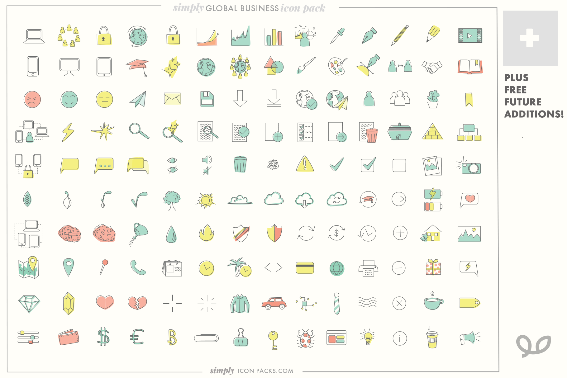
And we also feature custom icon design, since that if often wrapped up in the creation of a site:

custom icon design indie icons for sale

Of course, we’re open to any web related project.

The illustrations

You might notice the cute illustrations we used on the site, and think to yourself, “Where have I seen this style before?”

These illustrations are part of the open-source MIT-licensed illustrations of Katerina Limpitsouni’s project, UnDraw.

What’s extra awesome about these illustrations is not just that they are free to use and part of an extensive modern library that makes the web a more beautiful place, they are all vector! Meaning, each are completely editable and customizable. This is how we were able to create aliases of me and Onar matching the rest of the drawings.

Screen Shot 2018-11-30 at 1.40.53 PM.png
Screen Shot 2018-11-30 at 1.41.04 PM.png

If you have web needs beyond design, we’re here for you!

We just launched our site, and are looking forward to future opportunities to create together.

This project is part of our goal to build sources of income remote so that we can more easily visit our friends and families that are on opposite sides of the world.

Wish us luck!

Thanks for reading, and if you have any questions about our abilities, feel free to reach out to me (hello@loopandlaurel.design), fill out the form on the Little Eye site, or email us (hello@wearelittleeye.com).

—Daniella Attinella

tags: little eye web design, web design, design, remote design, remote work
categories: Design, Startups
Friday 11.30.18
Posted by Danielle Attinella
 

Simply Icon Packs: Royalty Free Indie Icons

Simply Icon Packs

Simply Icon Packs

Any web designer will tell you how often they are using and searching for icons.

There are several places on the web that offer free icons, but typically either you are required to give credit on your page or the icon isn't part of a comprehensive matching pack, meaning you might find one icon communicating what you need but the net one you find might be a different style. On top of that, often any free or paid for icon styles are limited and you tend to see the same files on many websites. 

These consistencies and uniqueness are important when doing high end work, so when I myself was searching for icons to use with my projects it hit me that I could simply draw my own. 

Initially I felt I didn't have time to make them myself, but as I increasingly spent more and more time searching for the perfect icon solutions to no avail, it was clear that I couldn't afford the time not to. This ensured each icon was in the same voice, plus after creating a handful based off need within a few months of freelance design work, I had close to a completed set that I could easily use for future projects. Plus they are customizable, so I could change the width of the line, or use of color/no color depending on what I was working on so they were appropriate to the brand still. 

Having these ready to go has saved me so much time in my designs, on top of that often clients are delightfully pleased to see more visual communication tools when they didn't expect it.

My partner, a developer, insisted in the value of icons like this from indie designers and encouraged me to make something with the concept. Since I'm basically always excited about starting new projects out there in the world I gladly accepted the challenge.

Hence- the birth of Simply Icon Packs!  

Simply Icon Packs logo

Simply Icon Packs logo

The goal of the logo was to make sure "Icon Packs" was most clearly visible from a distance with "Simply" having some more personality. I'm able to use the "Loop & Laurel" symbol as the crown of the logo- providing a subtle link to my two names without being overt. I did some research on other icon making firms out there, and decided on the Italicized Serif font as a way to differentiate to make sure I am my own brand. I actually really like how the Loop & Laurel logo acts like a crown because it reminds me of the word royalty, and I want people to remember these icons are royalty-free and CAN be used for commercial purposes. (Of course they can't be redistributed or sold though). I also like how "Simply" is set up to potentially down the road be a new entity.

140 Modern Business icons- Simply Icon Packs

140 Modern Business icons- Simply Icon Packs


Something that sets me apart from other icon options is I prepare the icons for color- they are ready to be used as-is but they also may be edited to specific brand colors.

I also offer custom icon add-ons in case a business knows they have specific concepts to communicate that wouldn't be included in the general pack.

Currently, as of July 2nd, I have 2 icon packs available on the website (a simple SquareUp site for now) and also on my new Creative Market page! (I'll write more about that later)

  • 140 Modern Business Icons color + no color (Simply Icon Packs) - Includes for free any future additions (I plan to add 10 more in the near future). Great for developers, designers, hobbyists, etc. Anyone that could benefit from having a ton of visual communication tools on hand.
  • 25 Italian Food & Drink Icons color + no color (Simply Icon Packs) - Perfect for branding, packaging, store signage, menus, sky's the limit! Great for business owners, designers, bloggers, etc.

For now I am working really hard on creating lots of icons! My notebook currently has a page of Travel-related icons that I'll be polishing and bringing them into the computer.

I also want to have fun with mockups of the icons- they can really tell a story of how these icons may be used. 
 

Italian Food and Drink (SimplyIconPacks.com)

Italian Food and Drink (SimplyIconPacks.com)

Italian Food and Drink (SimplyIconPacks.com)

Italian Food and Drink (SimplyIconPacks.com)

So that's it! Wish me luck on creating lots of new icons. It's fun for me to make them (the best part is adding the color). I hope as an indie designer I can figure out how to find people that would be interested in these. (Marketing is my least favorite thing.....unfortunately)

Thanks for reading,
Danielle

tags: icons, icon packs, simply icon packs, design, Remote Design, Remote Work, Graphic Design
categories: Design, Startups
Monday 07.02.18
Posted by Danielle Attinella
 

[How to] Make Glitter Glue! (in Photoshop)

HowTo_Glitter_blog.png

Sorry to disappoint if you thought this was a tutorial for how to make glitter glue IRL, BUT I hope this digital fabrication of it will bring you similar levels of joy.

Glitter is one of my favorite elements, maybe because it's often the opposite of professional so if I'm using it that means I'm working on a fun personal project that doesn't have any risk or feedback to it. I've been using the same glitter .pat files (mentioned below) for YEARS now and have learned some fun (basic) tricks with it. In this post you'll learn how writing or decorating rather messily before adding this glitter glue magic is a great way to get a little more loose in the digital space and have fun!

Ingredients

— Photoshop

— A way to draw in Photoshop (Wacoms make this a bajillion times easier IMO)

— Most importantly, the FREE .pat files this wonderful designer has graciously shared (that are made from actual photos of glitter!)

Steps

1. Have a new layer of its own where you roughly draw the words or shape you'd like to be in glitter.  Make sure your brush is 100% Hardness, 100% opacity, and make your best judgement on size for your needs.


****Don't worry at all about:****

Imperfection— Here imperfect is best. We're creating the look of something hand drawn remember, if the letters were perfectly spaced and squiggle free, it would look fishy. 

Color— We're eventually going to overlay the pattern on this so just use something easy to see.

Screen Shot 2018-04-30 at 11.28.46 AM.png

2. Taper some edges like the glue is running out, and conversely glob some edges, ends, and all places lines meet. Consider how glue consistency is- there are never sharp corners, and when lines meet they sort of join and bead together.

Screen Shot 2018-04-30 at 11.44.54 AM.png
Screen Shot 2018-04-30 at 11.37.55 AM.png
Screen Shot 2018-04-30 at 11.40.25 AM.png

3. Add the glitter! Make sure you have the .pat files installed. (If you don't know how or feel like doing this manually, you can simply open each .jpeg in Photoshop and go to Layer > Define Pattern...) 

Double-click on your layer to add a layer style.

Hit 'Pattern' and choose from the drop down one of your new glitter options.

Play around with the colors and scales for your needs. For some reason, (currently) Photoshop can scale your .pat files at 100%, or 50%. I have no idea why (if anyone knows the answer please share your wisdom), but any other percentage that does not fit this perfectly looks horrible and blurry. But luckily, the designer of these glitter patterns included images of glitter at different zooms. It might take some time to figure out which color and scale, at either 100% or 50% works best for your final output. Always judge your layer styles by final output! My example is 1200x1200 if you are wondering/following my numbers.

When picking which glitter color to use, I usually end up adjusting my background later depending on what the color inspires. Of course, you can always change the glitter color with a 'Hue' adjustment.

When picking which glitter color to use, I usually end up adjusting my background later depending on what the color inspires. Of course, you can always change the glitter color with a 'Hue' adjustment.

Congrats! you have glitter! ... but not glue yet.

4. We're going to add highlights/shading to give the illusion this is glue. To do this, we're going to use good ol' Bevel & Emboss. This part of the layer style modal can be frightening with its ability to create the kind of "late 80's uber-intense we're using computers now so lets show off the effects we can do with them" styles. BUT, it's all about subtlety here, and using the lowest settings we can to achieve the look. 

Make sure your highlights are overlaid as "Normal" - this is the most important part! This is how we achieve the glossed over glue style, and we luck out with this feature.

This step also takes some playing around and testing to see what works best at your scale. Remember at default settings, Photoshop's layer styles do not scale! So work at the final size (or higher if you will end up converting it to a smart object).

Below are my numbers (for a 1200 x 1200 canvas):

Screen Shot 2018-04-30 at 4.05.20 PM.png

I also recommend a very subtle drop shadow. Pay attention to the tapered edges you made when judging. Essentially we don't want this shadow to be even noticed, it should enhance the illusion without it being super clear why. 

Here are my numbers for my drop shadow:

Screen Shot 2018-04-30 at 4.10.11 PM.png

5. We're basically there! At this point I like to adjust the original drawing if it needs. For example, I felt my tapered edges needed to be even thinner after seeing the glitter glue texture on, so I used the eraser tool with no feather to adjust. You can add and adjust freely to this layer, the styles of course will stay the same.

CONGRATS! You've successfully made some glitter glue with no mess to your home.

If anyone uses this technique for a project I'd love to see what you've made.

Adding glitter glue is so much fun, even if its just for a personal art project. Hope this helped or inspired you do make something!


Best,
Danielle Attinella

HowTo_Glitter_blog.png
These roses were grown in our garden! They were so beautiful and our brown kitchen counter is the perfect spot to take photos of them. This was a Valentines Day post I made. <3 

These roses were grown in our garden! They were so beautiful and our brown kitchen counter is the perfect spot to take photos of them. This was a Valentines Day post I made. <3 

tags: glitter, design, graphic design, photoshop, photoshop tips
categories: Design
Monday 04.30.18
Posted by Danielle Attinella
 

tell me about your project ⚡️ hello@ella-ella.studio  I   © 2021